There are different types of charts which will be helpful in visualizing the data .Let’s take a look at the types and when we should use those charts in detail.
Types of charts :
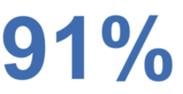
1. Simple Text
Just because we have numbers doesn’t mean we have to always use chart. It can be represented with simple text in bold to highlight the points we need to convey to viewers.
When to use this ?
- When we have to emphasize more on number ( ex.survey data where we want to specially emphasize on people chosen ‘yes’)
2. Table
This is the efficient way of representing data in table format with rows and columns.
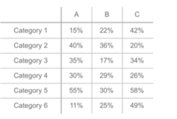
When to use this ?
- To compare values with one another
- To specify precise values
3. Heat map
This is graphical representation of data table with rows and columns where values are shown in color coded manner. It’s visualise data through various colouring and human eyes can easily pick out the difference in color intensity. This is useful during exploratory data analysis initial understanding and identify where to dig further with the data.
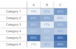
When to use ?
- To identify hotspots in the data
- To identify patterns or correlations between data
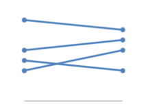
4. Scatter Plot
This chart will show the relationship between two variables .It’s similar to line chart but it shows individual points as dots rather than aggregating data points as one single line. It doesn’t show the exact extent of correlation.
We should avoid this chart for very large dataset as it will be hard to read.
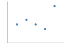
When to use ?
- To identify correlation between the two variables
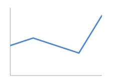
When to use?
- Show trends over time
- Comparison of two datasets
- To show ‘before and after’ story of different values
Horizontal
It’s a graph whose data are drawn horizontally.
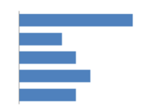
It’s a graph that shows comparison between two categorical variables.
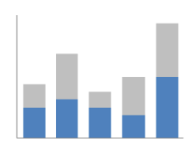
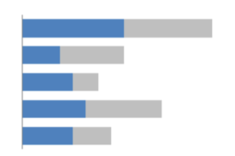
It’s a graph that shows the relative percentage of multiple data series taking whole percentage as 100%
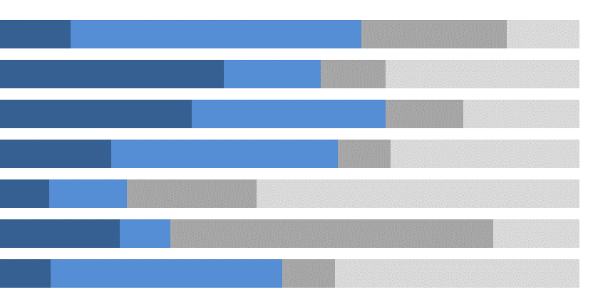
When to use?
- To compare large dataset of categorical values
- To compare categories and subcategories simultaneously
- To gather insights on deviations in data
8. Waterfall
This is the chart that shows the running total as values are added or subtracted. It shows how initial values are impacted by series of positive or negative values.
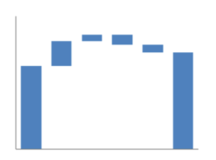
When to use ?
- To show from starting to final value
9. Pareto
It’s a chart that contains combination of bar and line chart. Bar chart shows the frequency of occurance and line chart shows the cumulative data percentage.
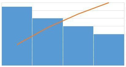
When to use ?
- To identify key problems and opportunities
- To identify areas to focus on first in process improvement
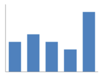
10. Histogram
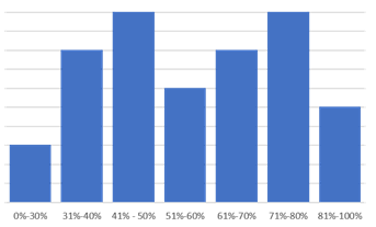
When to use ?
- To show distribution of dataset
- To deal with large dataset ( more than 100)

When to use ?
- -To display the data in engaging and aesthetic way
- To compare categories of data
It’s a graph where symbols are used and various dimensions to represent different variables in a dataset. Using geometrical shapes represents another dimensions to the chart.Glyph is a symbol that provides appearance or form of a character.
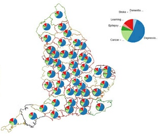
- To specify parts of Visualisation
It’s a chart that provides easy way to visualise how a variable varies across geographic region . It’s thematic map that is used to represent statistical data using color mapping symbology technique.
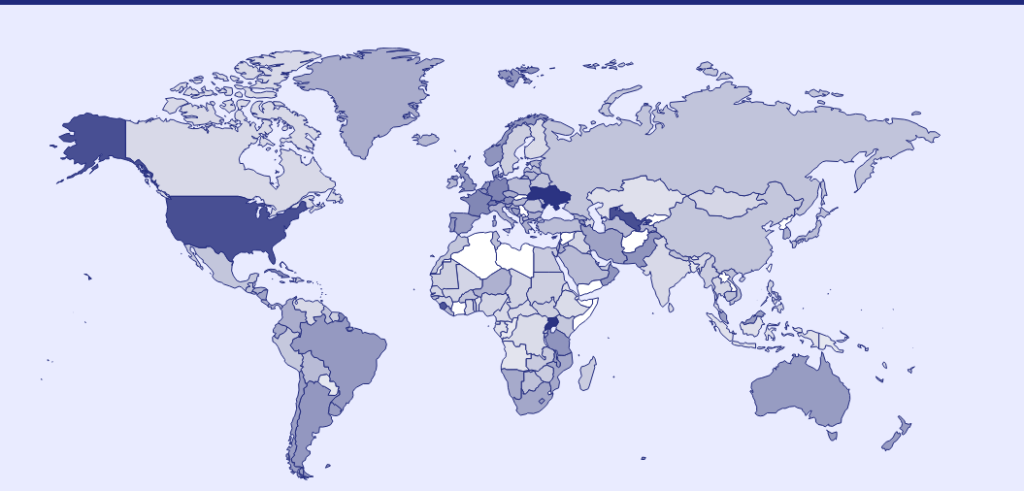
When to use ?
- Geographical area representation